Effects
Color & grading
The full grading suite — Color Grading's nine tabs, each of them also on its own, Levels with a live histogram, Curves, scopes, and a dozen more color tools.
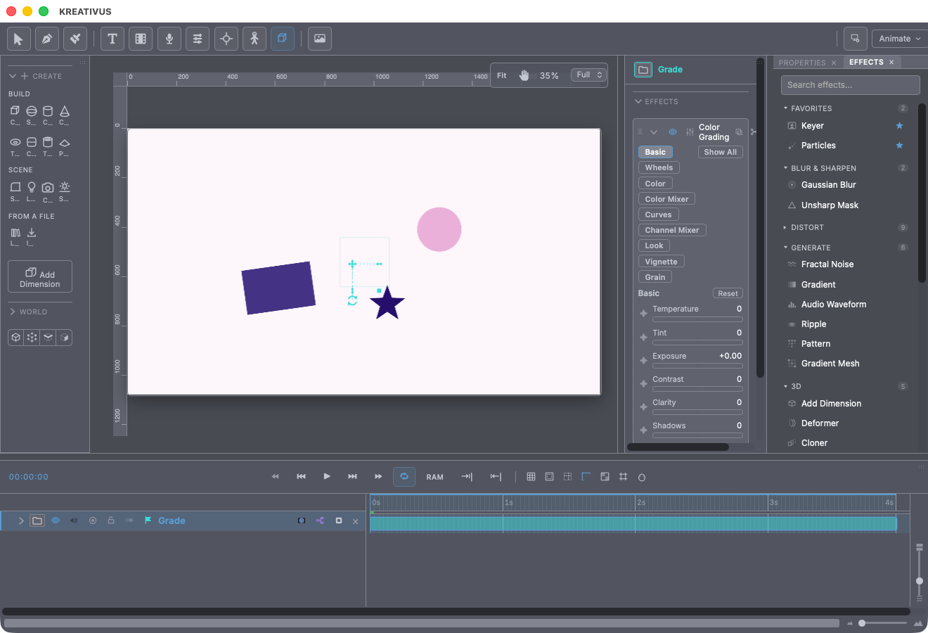
Twenty color effects, from a one-slider tint to a nine-tab grading console. Two useful conventions run through them: the correction tools (Levels, Curves, Channel Mixer, Shadows & Highlights, Hue/Saturation, Color Grading) are safe to add — true no-ops until you move a slider — while the look tools (Tint, Posterize, Threshold, Gradient Map, Black & White) visibly apply the moment they land, so you always see something to react to.
Put any of them on one layer to grade that layer — or on an adjustment layer to grade everything below it. That’s the whole-scene grade.
Color Grading — the console
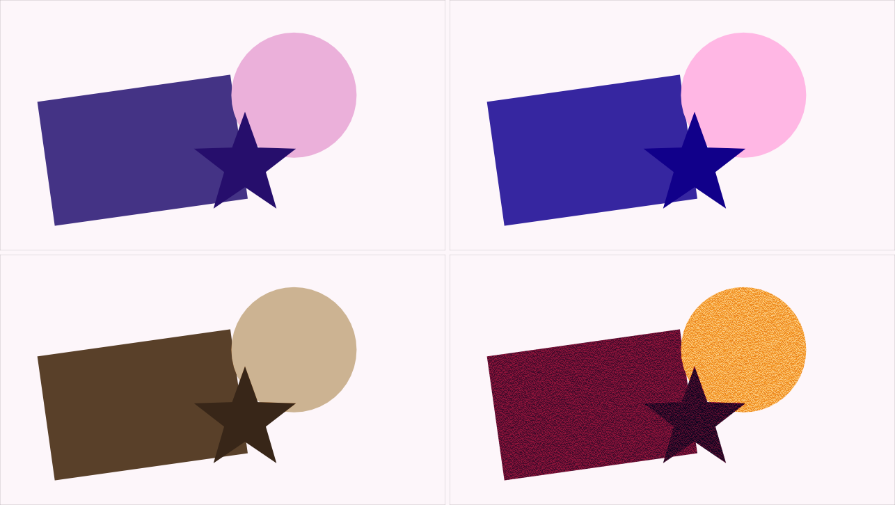
The all-in-one, Lumetri/DaVinci-class effect: nine tabs, run in a fixed professional order (primary correction first, creative finishing after). Two layouts — Compact (one tab at a time) for quick tweaks, Full (an accordion of everything) for grading in earnest — plus a per-tab Reset.
- Basic — White balance (Temperature/Tint), Exposure, Contrast, Clarity, and the four tone knobs (Shadows/Highlights/Whites/Blacks — the broad regions and the extremes, Lightroom’s own split).
- Wheels — a true Lift / Gamma / Gain three-way corrector, DaVinci-style discs with a luminance ring wrapped around each. The puck’s geometry is the real thing: any position is net-neutral on brightness, exactly like a hardware wheel, so pushing shadows toward teal doesn’t also darken them.
- Color — Hue, Vibrance (protects already-vivid colors while lifting the dull ones), Saturation, Lightness.
- Color Mixer — eight hue bands (Reds through Magentas, the Camera-Raw layout), each with its own Hue/Saturation/Luminance. Push just the sky’s blues, deepen just the skin’s oranges.
- Curves and Channel Mixer — the same editors as the standalone effects, nested.
- Look — a real .cube LUT slot with an Intensity blend, plus 16 built-in looks: Teal & Orange, Warm Vintage, Cool Blue Cinematic, Bleach Bypass, Cross-Process, two B&Ws, Faded Film, Punchy Vibrant, Vivid Slide, Soft Portrait, Standard Reversal, Cinema Flat, Vintage Negative, Nostalgic Warm, Monochrome Film. Each look also dials in its film stock’s grain — the grain is as much part of a stock’s character as its color.
- Vignette — bipolar Amount (negative brightens corners), Midpoint, Feather, Roundness.
- Grain — Amount, Size, animated or frozen, monochrome or per-channel color.
The whole console is GPU-accelerated — all nine stages run as compute shaders in one pass.
One stage at a time
Sometimes the console is more than the shot needs. Every stage of it is also a small effect of its own, addable on its own, keyframable the same way — pick one off the shelf when the answer is “this is a bit blue” rather than “this needs a grade”.
- White Balance — Temperature and Tint.
- Exposure — Exposure, Contrast, Clarity.
- Color Wheels — the Lift/Gamma/Gain three-way, discs and all.
- Color Mixer — the eight hue bands.
- LUT — a
.cubeslot, the 16 built-in looks, and an Intensity blend. - Vignette — Amount, Midpoint, Feather, Roundness.
- Film Grain — Amount, Size, animated or frozen, monochrome or color. Unlike the tab it comes from, this one arrives visible: you asked for grain, you get grain.
Four of the console’s stages were already standalone effects before it existed, and still are: Curves, Channel Mixer, Hue/Saturation and Shadows & Highlights, each below.
These are the same code as the tab, not a lighter version of it — same maths, same GPU pass, same knobs. Stack two or three and you have built exactly the part of the console you wanted, in the order you wanted it, and you can put a blur between them.
Each one opens with a Preset dropdown — a complete look in one click, which you then tweak. White Balance knows the lights that cause a cast (Tungsten Fix, Open Shade Fix, Fluorescent Fix) rather than the direction of the correction; Color Wheels has Teal & Orange, Bleach Bypass, Faded Film and three more; Color Mixer has the six adjustments people actually reach for (Deepen the Sky, Warm the Skin, Autumn, Pop the Reds, Mute the Greens, Neon Night); Vignette and Film Grain have six each. A preset replaces every control below it, so pressing two in a row gives you the second — never a mixture. LUT has no dropdown because it already has the 16 built-in looks, with a preview for each.
Levels
The classic five-control remap — Input Black/White, Gamma, Output Black/White — with a live histogram behind draggable handles, exactly like Photoshop’s dialog. The histogram shows what’s actually feeding this instance (effects above it in the stack included), so you’re always reading the truth. Five channels: RGB composite, R, G, B — and Alpha, its own independent channel for remapping transparency. Every slider keyframes.
Curves
The tone curve, drawn properly: click to add points, drag freely, double-click to remove; endpoints stay pinned to the full range. The interpolation is a monotone spline — the variant specifically chosen because it cannot overshoot between steep points, so a hard S-curve never produces the banding or inversion artifacts a naive curve tool does. Same five channels as Levels, alpha included.
Channel Mixer
Each output channel rebuilt from percentages of all three inputs plus a constant — the After Effects layout, one output channel per tab. The identity matrix by default; infrared looks, channel-swap effects and precise color surgery live here.
Shadows & Highlights
Four bipolar knobs — Shadows, Highlights, Whites, Blacks — each pushing brightness in a luminance-weighted region rather than uniformly: the first pair works broad regions, the second the true extremes. Brightness-only by design, so hue never shifts.
Hue/Saturation
Four masters: Hue (wraps around the wheel), Vibrance, Saturation, Lightness. Vibrance runs first and dampens its own push on already-saturated pixels — boost the dull, protect the vivid — and pure grays are left genuinely untouched by saturation moves, so line art survives a global color push.
Tint
Maps the image’s brightness between two colors — plus the improvement that fixes every cheap duotone: a Midtone point. Two-point tinting can only draw a straight line between its ends, which is why those duotones go muddy through the middle; the third point is what makes a real split tone (cool shadows, warm highlights) or a proper sepia possible. Keep Luma borrows only hue and saturation while the picture keeps its own brightness — the difference between “colorised” and “crushed into a gradient.” Six presets: Sepia, Cyanotype, Split Tone, Moonlight, Gold Leaf, Bleach Bypass.
Gradient Map
Tint’s bigger sibling: brightness mapped through a full multi-stop gradient, with the same editor your fills use. Then the pair that makes it an animation tool: Cycles reads the ramp several times across the brightness range — the picture bands into contours — and Phase rotates the ramp along itself. Keyframe Phase and the bands travel: the classic color-cycling look. Wrap decides the seam — Repeat (hard bands: contour lines, thermal maps) or Ping-Pong (seamless — a smooth spectrum however many times it repeats). Dither breaks band edges into stipple; Invert flips which end of the ramp the darks map to. Five built-in looks (Duotone Ink, Thermal, Contour Lines, Oil Slick, Sunset Grade) plus eleven quick gradient presets — and you can save your own.
Posterize
Levels (2–32 flat steps) plus two upgrades over the stock version: Gamma decides where the steps land — below 1 crowds them into the shadows so the darks keep detail while highlights flatten, which is why stock posterize so often eats exactly the part you cared about — and Smoothness adds a fixed-pattern dither that breaks hard band edges without crawling. Quantize picks RGB (each channel independently — the classic poster, and also what turns skin into three unrelated colors) or Luma — brightness only, hue kept: what cel shading actually wants. Presets: Poster, Cel Shade, Deep Shadows, Retro Dither, Hard Cut.
Threshold
The hard cut — with three twists. Below/Above colors are choosable, so a threshold becomes a duotone, an ink stamp, a blueprint or a silhouette without stacking a Gradient Map on top. Dither breaks the cut into a stipple that stays exactly two colors — newsprint, photocopy. And Channel: cut on Luma, on a single channel (red ink on cream paper cuts cleanly on Red and terribly on luma), or on Alpha — which turns any soft, feathered matte into a hard-edged one, something nothing else in the app can do. Presets: Ink Stamp, Blueprint, Photocopy, Risograph Duotone, Silhouette, Hard Matte.
Black & White
Per-hue grayscale conversion across eight bands (Reds through Magentas): each band’s slider decides how bright that hue lands in the gray result. Darken the blues and a sky goes dramatic; lift the oranges and skin glows — the way a film photographer uses colored lens filters.
Leave Color
Keeps one hue; desaturates the rest — the red-coat-in-a-gray-world shot. Pick the color with the inline eyedropper straight off the viewport (the effect deliberately stays off until you’ve picked, so you’re always sampling the original colors), then shape the band with Tolerance and Edge Softness, and dial Amount to Decolor.
Color Match
Recolors this layer to match the palette of another layer or an imported image — the standard statistical color transfer (the same approach Photoshop’s Match Color uses). Sample once from a reference; Influence blends toward the match — and past 100 it extrapolates beyond the matched result, pushing harder in the same direction. Great for making a pasted element sit in a plate, or forcing two shots toward one palette.
Scopes
Grading by eye lies; the Scopes panel (in the panel dock) doesn’t. Four modes — Waveform, Vectorscope, Histogram, RGB Parade — reading the very pixels the viewport just painted, with a quad layout that shows all four at once while you grade.
Recipe — the two-minute grade. Adjustment layer over the scene → Color Grading. Basic tab: set white balance and exposure. Wheels: a touch of teal in Lift, warmth in Gain. Look tab: Teal & Orange at ~40 Intensity. Watch the Parade while you do it.
Recipe — cel-shade a render. Posterize → Cel Shade (3 luma steps, hue kept), then Threshold → Ink Stamp on a duplicate for the line pass. Flat-shaded animation out of any footage.