Effects
Deconstruct
Take any picture apart into a grid — nine tilings times eight cell styles, halftones and mosaics, scrambles and reveals, all keyframable.
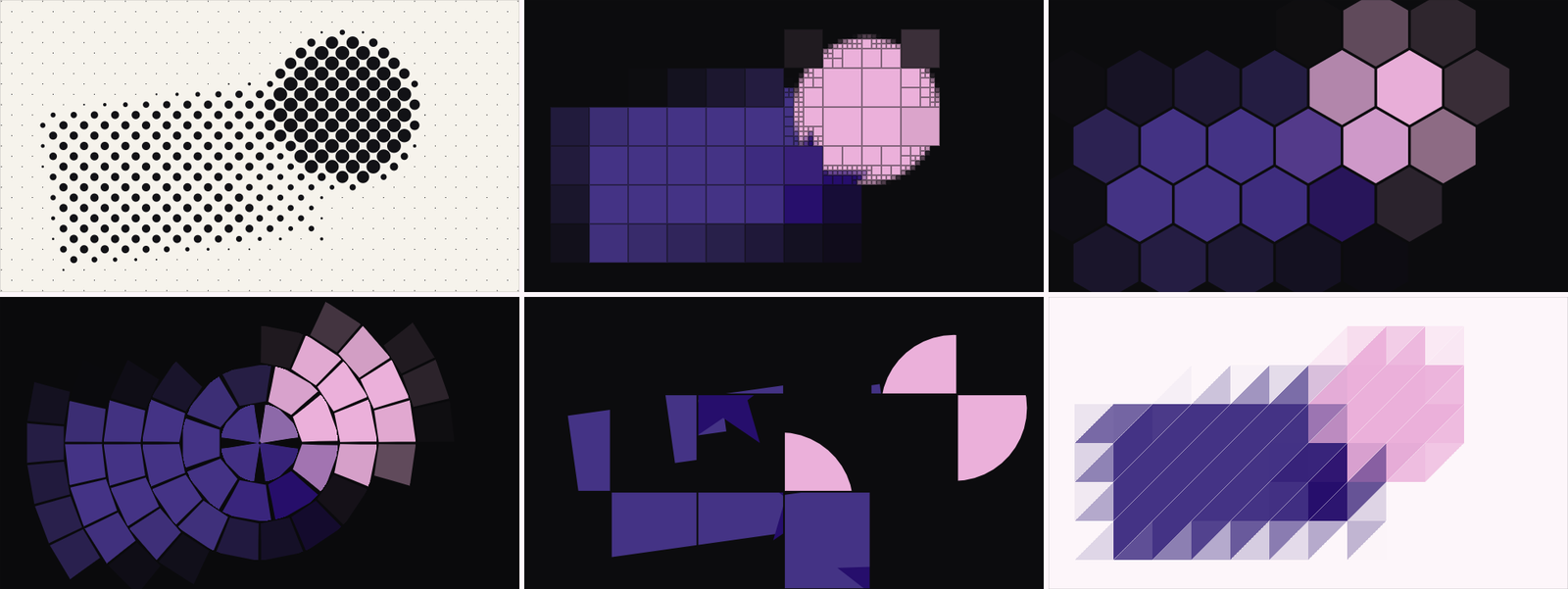
Deconstruct takes any picture apart into a grid and rebuilds it out of cells. Mosaic-style averaging is the least of it — this is the effect for halftone posters, dot-matrix screens, low-poly facets, sliding-puzzle scrambles, and cell-by-cell reveals. It works on any visual layer, comp or group, and every dial keyframes.
Like Pattern, it’s built on two independent axes: a tiling answers where the divisions fall, a cell style answers what lands in one. Nine tilings × eight cells = seventy-two looks that all animate the same way — where other apps ship each look as its own sealed effect.
The nine tilings
Square (the plain grid), Brick (offset rows — running bond, subway tile), Hex (honeycomb), Triangle (facets), Diamond (the grid on its corner), Columns and Rows (full-length strips), Radial (rings and wedges around the centre — a dartboard of the image, with the wedge count growing outward so every cell stays about square) — and the one no one else has:
Quadtree — cells that subdivide only where the picture is busy. A face keeps its eyes while the wall behind it becomes four big blocks. Detail sets how eagerly it splits. It’s the look that makes a poster read as deconstructed rather than merely pixelated.
The eight cell styles
Fill is the classic mosaic — flat average colour, edge to edge, in any tiling. Image keeps the picture itself inside each cell, so the grid shows only through the gaps and the motion. The rest turn brightness into a size rather than a colour — which is what halftone, dot-matrix and newsprint looks all are:
- Dot — a circle whose radius follows brightness. Halftone.
- Square — grows with brightness. Dot-matrix, Bauhaus posters.
- Ring — hollow; reads as line art rather than tone.
- Bar — rises from the cell’s bottom. Equaliser, data poster.
- Cross — register marks, technical drawings.
- Line — a stroke lying across the local image gradient, so strokes follow edges around the picture the way a hatching pen would.
Size works in Pixels or in Cells across the frame — asking for four big cells should be typing 2, not computing half of 1920; and counting cells also fits whole cells flush to the frame’s edges, which is the difference between a poster and a screenshot of one.
Colour
Colorize pushes every cell toward one Ink colour — at 100 the picture survives only as the size of the shapes, which is exactly what a one-colour halftone poster is. Background is what shows between and behind cells: transparent by default (so the effect drops onto a stack without painting a card behind it), white for newsprint, black for a light-box.
Taking it apart
The Motion tab is where the poster becomes a shot:
- Swap + Reach + Tumble — the scramble. Swap is how many tiles are showing somebody else’s piece of the picture; the whole image is still there, only rearranged, never duplicated or dropped. Reach is how far a tile may travel when it trades (small reads as a glitch, large scatters it across the frame); Tumble puts pieces back the wrong way round. Keyframe Swap from 0 and the image comes apart into itself.
- Explode — pushes every cell away from the centre by a share of its own distance (or pulls inward, below zero).
- Jitter — scatters cells off their spots; the dice come from the Seed, so it holds still across the clip instead of boiling.
- Reveal + Order — a wipe made of cells rather than pixels. Order picks who arrives first: Random (the picture assembles out of noise), Brightest (the image builds out of its own light), Darkest, From Center, or a straight Sweep at the grid’s own angle.
And Motion — six self-running moves that need no keyframes at all, each a pure function of the frame number (they loop, they scrub): Shuffle (tiles trade places on the beat), Wave (a travelling swell of size), Pulse (every cell breathes), Spin (each cell turns on the spot, half the other way), Drift (the divisions travel over a still picture), Flicker (cells blink out at random — bad signal, dying sign). Speed and Motion Amount dial it.
The 23 presets
Grouped in the browser as Print (Newsprint Halftone, Risograph Dots, Blueprint Grid, Ben-Day Comic, Contact Sheet), Grid (Big Blocks, Honeycomb, Low Poly Facets, Detail Quadtree, Venetian Blinds, Dartboard…), Scramble (Sliding Puzzle, Glitch Slip, Full Scatter…) and Motion (Breathing Grid, Rolling Wave, Broken Sign, Cell Wipe, Blow Apart…). Every tile in the browser is the real effect running, not a picture of it — and your Size, Centre, Angle and Seed survive a preset, so it never moves the grid off what you lined it up with.
Recipe — a cell-built title reveal. Put Deconstruct on your title card: Quadtree tiling, Fill cells, Order → Brightest. Keyframe Reveal 0 → 100 over a second. The title assembles out of its own light, detail arriving where the picture needs it.
Recipe — newsprint portrait. Preset Newsprint Halftone, then set Background to paper-white and Size to taste. One click from photo to print.